Posts in Work by Tammy Matute
Éloquent Magazine
 

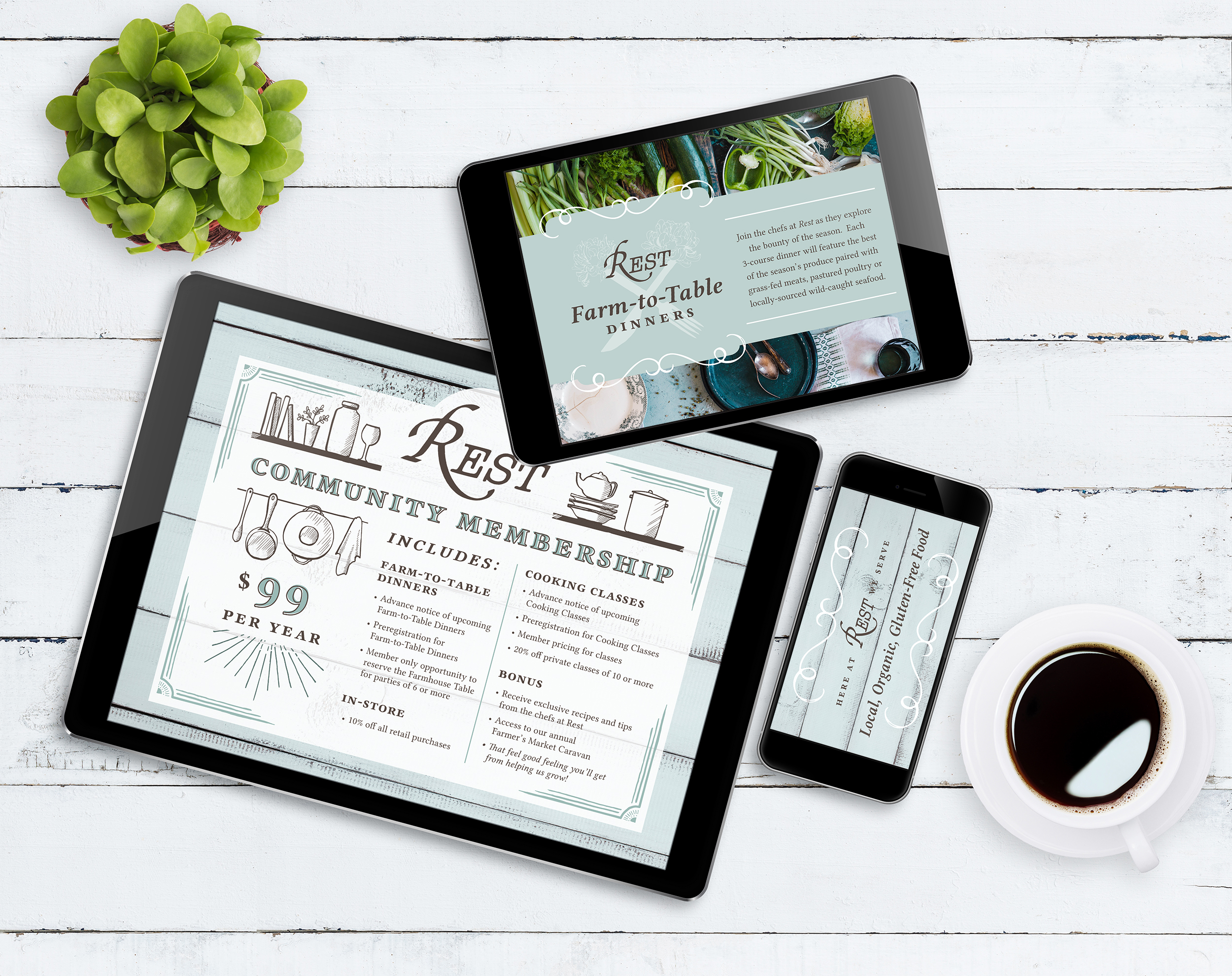
Éloquent Magazine publishes stories of modern day heroines in the home, at work, and abroad. Through style, they are re-imagining the mysterious beauty, and rare exquisite charm that is woman.

 
ELOMAG_rolledup.jpg


Éloquent Magazine first approached Tammy to create a masthead for their publication but also to serve as a logo for their online presence. When discussing what they were looking for, they desired a distinctive, elegant, bold and legible design. You may glance over the design process of the logo, here. After the masthead was established, Tammy was asked to design the cover, and a couple spreads of their debut issue of the new logo look in 2016. They returned to Tammy for their summer issues of 2017 and 2018, in which she designed the cover, table of contents and several editorials and features. To continue with their established aesthetic, Tammy kept the spreads clean, elegant, and bright. 


ELOMAG_cover-NOspine.jpg
ELOMAG_TOC.jpg
ELOMAG_cover-wspine.jpg
 
 
ELOMAG_bottom-logo.png


Neha+Randy Invites
 

This colorful wedding needed equally bright and one-of-a-kind invitations.

 
featured-neha-wedding-pic1.jpg
 
 
neha-balram_icon.png


The bride let Tammy work her magic under these two main conditions: the wedding invitations must incorporate an illustration style like Sanjay Patel, and that the design must not fall into the generic Indian motifs of elephants, paisley, peacock, etc. So, Tammy chose vibrant colors, geometric shapes/patterns, mid-century trends, to keep the invitations looking modern and hip and colorful. You can read more about the process on our blog.


featured-neha-wedding-moodboard.jpg
featured-neha-wedding-pic2.jpg
featured-neha-wedding-pic3.jpg
 
 
Rest Farmhouse Inspired
 

Rest Farmhouse Inspired is a distinctly woman-owned business that offers a unique culinary experience, professional chef services, and is a gourmet kitchen supply store.


rfhi_LIRI_hires-logo-brown.png


Rest Farmhouse Inspired was seeking a brand overhaul which would result in a cohesive rustic, fresh and comforting look. Their marketing materials include an informational card, punch cards for their coffee and bone broths, and flyers for their various seasonal cooking classes. Package design was also needed for their daily goods, such as pastries, cold brews, almond milk bottles and sodas. Signage and posters were also created, the drinks and bone broth chalkboard menu hangs above the barista area of their Montrose location.


rfhi_bottom.png


Wedding Jammy
 

Subdued elegance for this
edgy Highland Park wedding.


josh-and-tammy_text.png


Of course the bride, Tammy, would design her entire wedding suite. Going against what was expected, the resulting wedding stationery strays from her typical love of pastel hues and soft textures. Constructed instead was a balance between the groom's and bride's aesthetics; minimalist, gestural and non-traditional. Every paper material imaginable was designed: save the date postcards, mailing labels, tri-fold invitations, programs, menus, posters, table numbers, name cards, etc. More on the elements chosen for the design can be read on her personal blog.


SP_wedding-jammy-invite-1.jpg
SP_wedding-jammy-invite-2.jpg


Photo Credit to Caleb John Hill Photography


Brianna Johnson Creative
 

Brianna Johnson is a native of Los Angeles working towards a Masters in Interior Architecture with an interest in sustainable architecture and design.


Brianna of Brianna Johnson Creative came to us in need of personal branding, more specifically, business cards for her interviews with potential employers as well as for any prospective freelance jobs. She already had the turquoise and pink color scheme in mind, and desired a unique and bold look that still maintained a professional presence. Tammy's hand-lettering was the perfect fit for her logomark. Utilizing a double-sided business card created room for the gestural logomark to really stand out, allowing her contact information to be displayed in an unconventional way. Tammy focused on having the branding be a reflection of Brianna's design style: bright, clean and unorthodox.